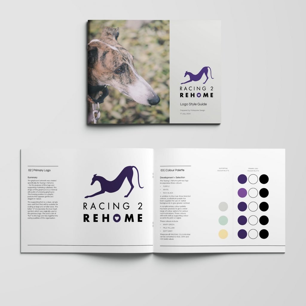
Racing 2 Rehome were looking to refresh their logo and branded assets. Their old logo needed to be updated and wasn't translating well across all of their touch points. A revised visual identity was required to label merchandise, brand their vehicles and create signage for events.
The greyhound artwork was created specifically for Racing 2 Rehome - for the purpose of this logo and supporting marketing collateral. The shape of this greyhound is a minimal silhouette of a bowing greyhound. This bowing position is a playful posture that appears gentle and elegant in nature.
The supporting font is a clean, simple sans serif font that will be suitable for scaling at large and smaller sizes. The letter “O” incorporates the love heart symbol, which was originally used in the previous logo. This adds a bit of “fun” to the logo and ties together the caring qualities of the organisation.