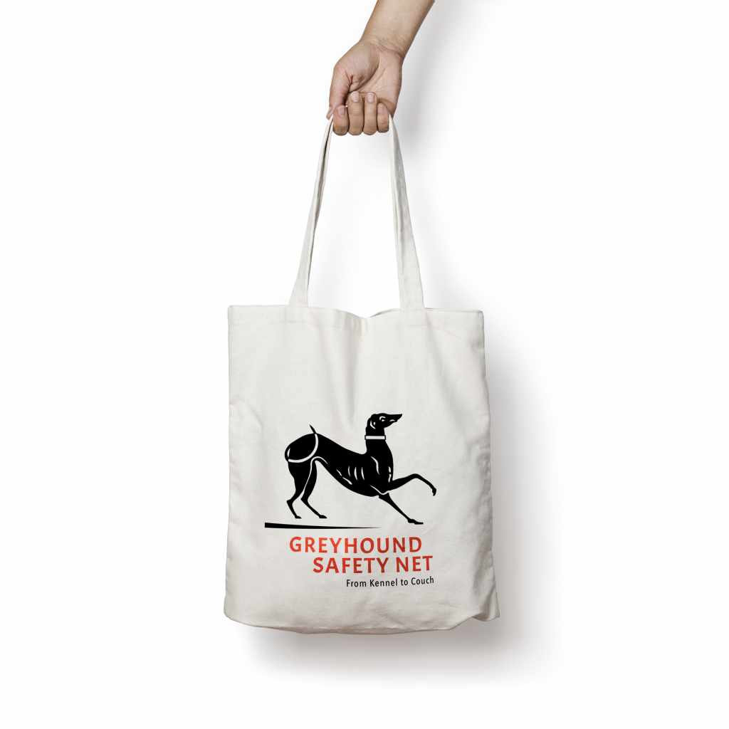
The Greyhound Safety Net had been using a dated logo which needed to be translated across multiple mediums. The logo redesign needed a more modern look and feel whilst retaining a clear link to the branded colour palette.
Typography was addressed to include both the brand name and tagline. Several layout options were required to provide legibility across different scaled versions. The greyhound artwork icon was vectorised and the overall shape and detail was cleaned up and refined. The colour palette was formalised with assigned Pantone colour values and their equivalent RGG, CMYK and HEX values. A logo styleguide was provided with multiple versions of the final logo for the various application specified.